Puedes registrarte haciendo Click Aca y disfrutar todas las características de nuestra comunidad, desbloquear los foros ocultos y descubrir los aportes que tenemos. Te deseamos una estadia placentera y ojala que disfrutes del foro.
Forums

No estás conectado. Conéctate o registrate

Ver el tema anterior Ver el tema siguiente Ir abajo  Mensaje [Página 1 de 1.]

1Project Seduction Empty Project Seduction Dom Ene 22, 2012 7:04 am

fafacu2012

fafacu2012
VIP Member
VIP Member
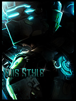
en esa firma trabaje los efectos de iluminacion con la pentool, use topaz pero creo que esta vez no se me pase

[Tienes que estar registrado y conectado para ver esa imagen]

2Project Seduction Empty Re: Project Seduction Dom Ene 22, 2012 9:03 am

Eunice

Eunice
GC Supermod
GC Supermod
Me encanta!!! O_O
Que buena la ilu que le has dado. Lindo fondo.
La font me requetegusta,pero quizás le cambiaría la posición.
Algún día aprenderé a hacer la ilu con la pentool :_(
Buenísima tag fafacu. Gran trabajo.

3Project Seduction Empty Re: Project Seduction Dom Ene 22, 2012 10:35 am

Luis

Luis
Core Official
Core Official
VAYYA.. QUE TRABAJO... LA ILUS TE QUEDO BUENISIMA... LA COMPO IGUAL... PERO COMO DICE EUNICE LA FONT ES MUY BUENA PERO ME PARECE QUE EN OTRO LADO... TAL VEZ MAS ARRIBA..ESTA FIRMA QUEDARIA BIEN PARA UN DUAL TONE... XD.. SUERTE.

4Project Seduction Empty Re: Project Seduction Dom Ene 22, 2012 12:08 pm

SHOGUN-SHG

SHOGUN-SHG
VIP Member
VIP Member
todo muy bien me gustaron la dualidad de colores la font quedo bien solo la colocaria en otra posicion

5Project Seduction Empty Re: Project Seduction Dom Ene 22, 2012 1:46 pm

mariocent

mariocent
Core Official
Core Official
muy buena pero la font hay que colocarla en mejor lugar ahi no se ve bien

6Project Seduction Empty Re: Project Seduction Dom Ene 22, 2012 5:40 pm

Camus

Camus
Core Official
Core Official
Que buenos tonos y que buena ilu^^ Coincido en que la font no va tan esquinada xD

7Project Seduction Empty Re: Project Seduction Lun Ene 23, 2012 9:40 am

gustavo11s

gustavo11s
Core Official
Core Official
esta buena.. lindo tonos y compro
pero le falta algo d emas integracion con el render

8Project Seduction Empty Re: Project Seduction Lun Ene 23, 2012 11:47 am

Annoying Laserman

Annoying Laserman
VIP Member
VIP Member
Tiene buena compo, mejora la posicion de la font y la tipografia, mejora la integracion por tonos, pero la dualidad es awesome *0*

9Project Seduction Empty Re: Project Seduction Lun Ene 23, 2012 11:49 am

zephyrus

zephyrus
Core Official
Core Official
Muy buena...solo hay que mejorar la font

10Project Seduction Empty Re: Project Seduction Lun Ene 23, 2012 12:26 pm

kaos[jajaja]

kaos[jajaja]
Core Official
Core Official
Buena tag.
Me gusto la iluminación.
Los colores quedaron bien repartidos.
Para mi la font debería ir un poco mas arriba.

11Project Seduction Empty Re: Project Seduction Lun Ene 23, 2012 2:59 pm

RedClown

RedClown
GC Founder
GC Founder
Interesante!
siempre me han gustado las firmas duales
en este caso el fondo del lado azul me gusto

al igual la font, pero se veria mejor mas arriba

12Project Seduction Empty Re: Project Seduction Lun Ene 23, 2012 3:07 pm

Understroyer

Understroyer
VIP Member
VIP Member
UN aplauso
(una ovacion despues...)

esta genial men esta limpia el fondo genial
la ilu megusta
la font megusta
los tonos megusta

quizas le pondria la font mas arriba y ya. esta muy buena fafa es de las mejores tuyas (que yo haya visto por q por aca soy nuevo jeje)

13Project Seduction Empty Re: Project Seduction Lun Ene 23, 2012 4:08 pm

fafacu2012

fafacu2012
VIP Member
VIP Member
gracias por los consejos

Contenido patrocinado


Ver el tema anterior Ver el tema siguiente Volver arriba  Mensaje [Página 1 de 1.]

Permisos de este foro:
No puedes responder a temas en este foro.